StoryFind Films
Logo and Brand Development
Tools
Adobe Illustrator
Adobe InDesign
Handy-Dandy Sketchbook
Role: Senior UX/UI Designer
Mood Board Presentation
Logo Design
Brand Style Guidelines
Brand Asset Creation
The Client
StoryFind Films is a team of creative filmmakers helping nonprofits stand out through powerful storytelling. Originally named Reliant Studios, the company’s leadership sought to rebrand the company as more than just a video production company — they are professionals capable of capturing a nonprofit’s core mission and connecting back to the hearts of donors.
The Challenge
The StoryFind Films team needed a new logo that was capable of scaling with them as they grew. Not only did they need a logo for the StoryFind Films brand, but their logo needed to be versatile and ultimately serve as the logo for the overarching StoryFind brand, of which Films would just be one part. I had to create a logo that could stand apart from the filmmaking side of the business when needed, and I needed an icon that would stand out on their future mobile app as well.
Project Overview
Beginning with a mood board, I developed five unique design directions to better understand what the client was envisioning for their new logo and brand. This gave me the opportunity to present these potential directions and to have a conversation with the client about how they wanted the StoryFind Films brand to be perceived by their audience.
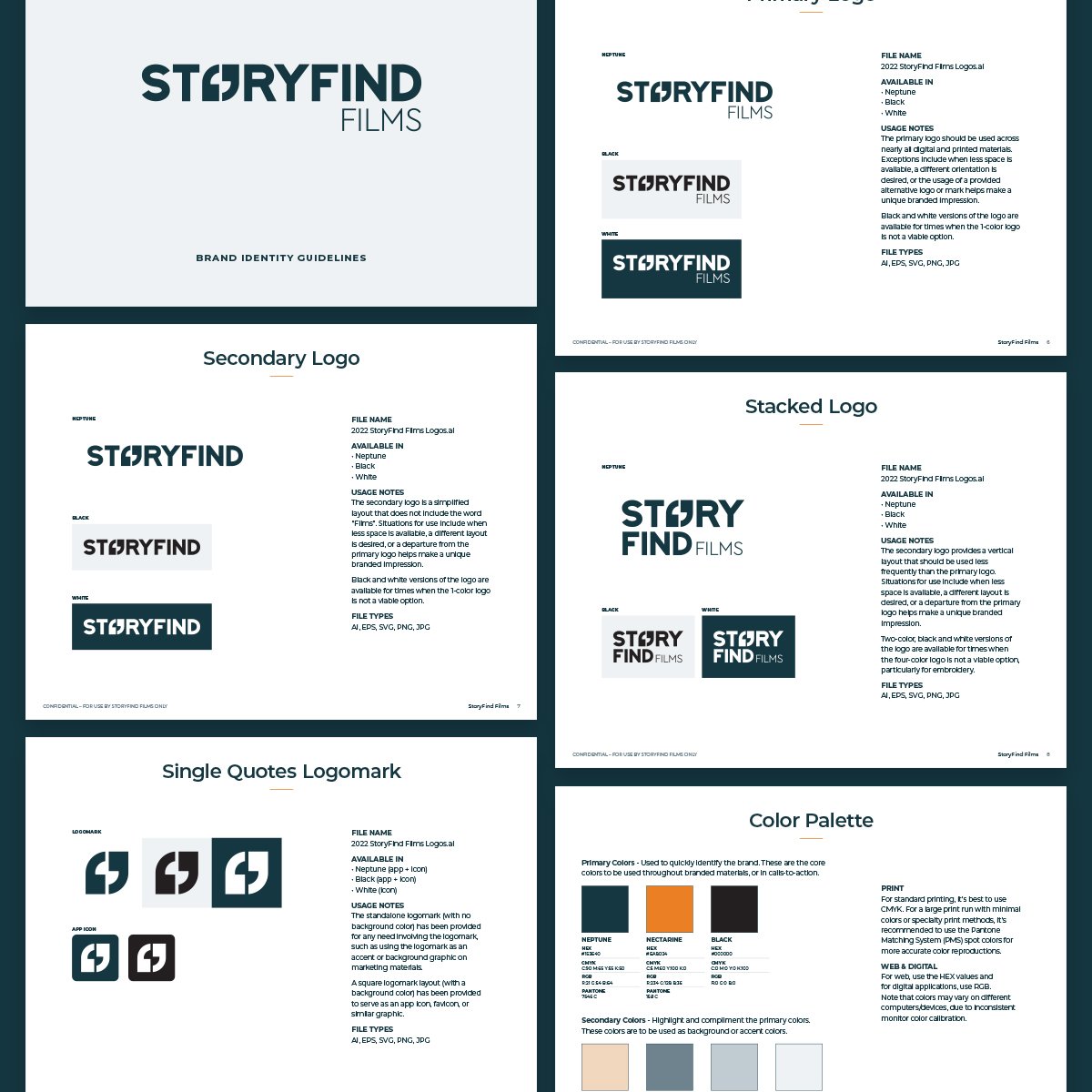
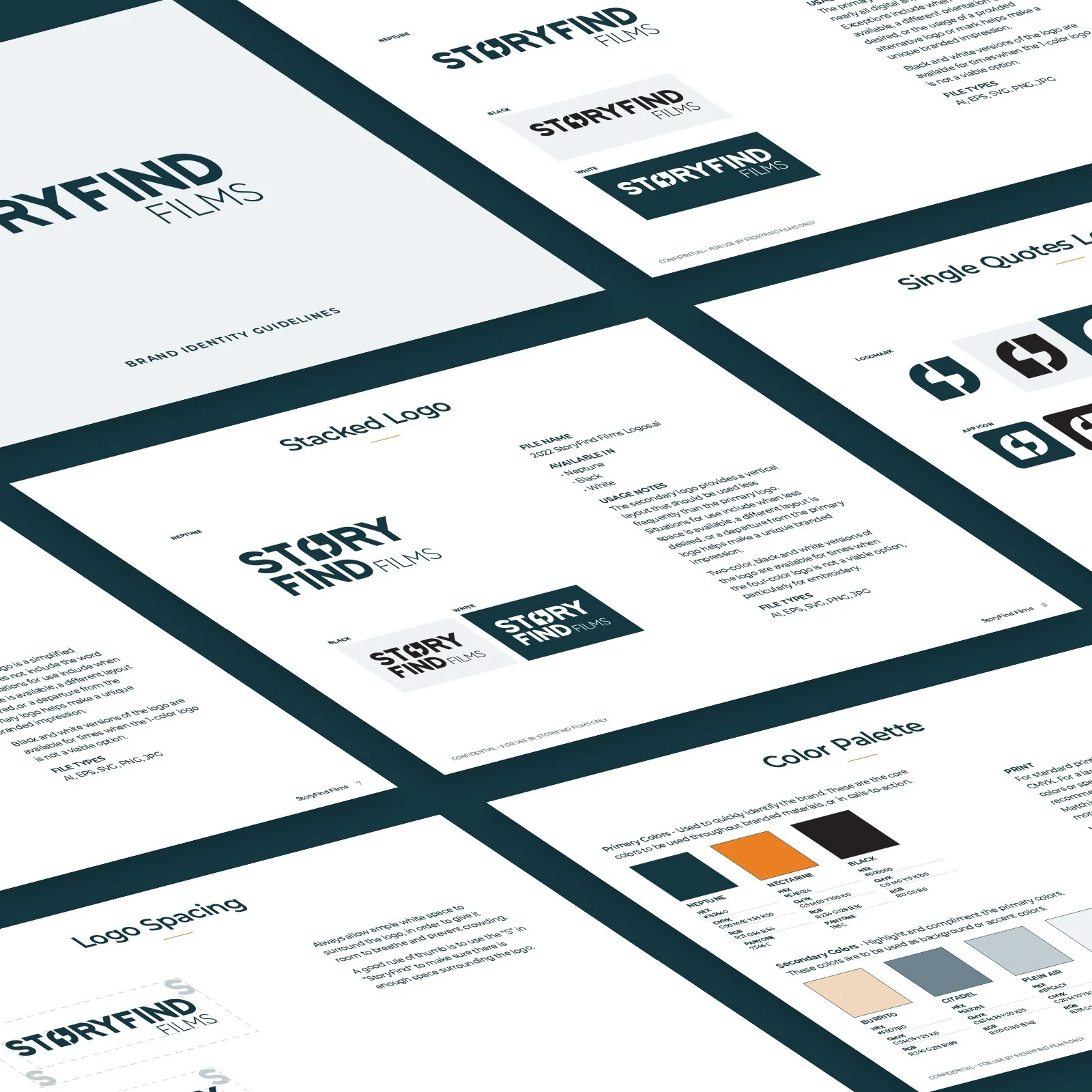
Once the client selected a design direction, I began working on the black-and-white logo concepts, eventually leading to the creation of color logos and a color palette. With the approved logo in hand, I built out the StoryFind Films brand style guides to explain logo usage, define brand colors, and showcase typography styles.
Lastly, I created a number of digital assets for the StoryFind Films team with their new logo, colors, and typography, including a branded presentation deck template, a letterhead template, and a proposal template.
Mood Board
The five design directions were all based on the same ten brand value keywords that I put together based on the creative brief and the messaging our team developed for StoryFind Films:

These brand values helped guide my work and my conversations with the client throughout the project. I referred back to the mood board during the entirety of the logo design process, as a way to remind the client where we started out and why I had made certain design decisions.

Logo Design
Moving into logo development, I started by sketching out ideas related to the conversations I had with the client and the overall design direction they chose. When designing logos, I often write a list of keywords of relevant topics or objects that help guide me as I iterate.

StoryFind Films Initial Logo Sketches: Some of these logos, which did not show up in Round 1 of the black-and-white logo concepts, ended up inspiring designs shown in Round 2.
This project was unique in that we ended up having two rounds of logo concepts — the first round just didn’t hit the mark for the client. I had already begun working on color palette options for the logo and brand when it was made clear that the first logos just weren’t cutting it. I stopped working on the color concepts and dove back into developing a new round of logos, with the goal of finding the perfect logo that the StoryFind team could truly call their own.
Ultimately, the final logo included a much bolder, blocker typeface. In the place of the “o” in “StoryFind”, I placed the icon, a combination of two single quotation marks. These quotation marks signify StoryFind’s goal of capturing the heart of the story of their client’s work and mission. The icon also visually represents a viewfinder frame and calls back to StoryFind’s initial foundation as filmmakers.

StoryFind Films Black and White Logo Concepts: The two different rounds of design concepts highlight the primary challenge I faced with this project — creating a logo that the client truly felt aligned with their vision for the company. While the first round of designs were strong and fit the original direction that the client had sought, we found that the logos were ultimately too elegant and feminine. The final logo ended up being much bolder, and more simplified, than the initial abstracted designs.


Brand Style Guide
Following approval of the logo and color palette, I created a brand style guide to outline the use of the brand elements I had created. We ended up having a few different logo options, so it was important to define how and when each logo layout should be used. In addition to the logos, I made sure to include information on the brand color palette and typographic styles.